Illustration


Creativtypes artwork for their beautiful office

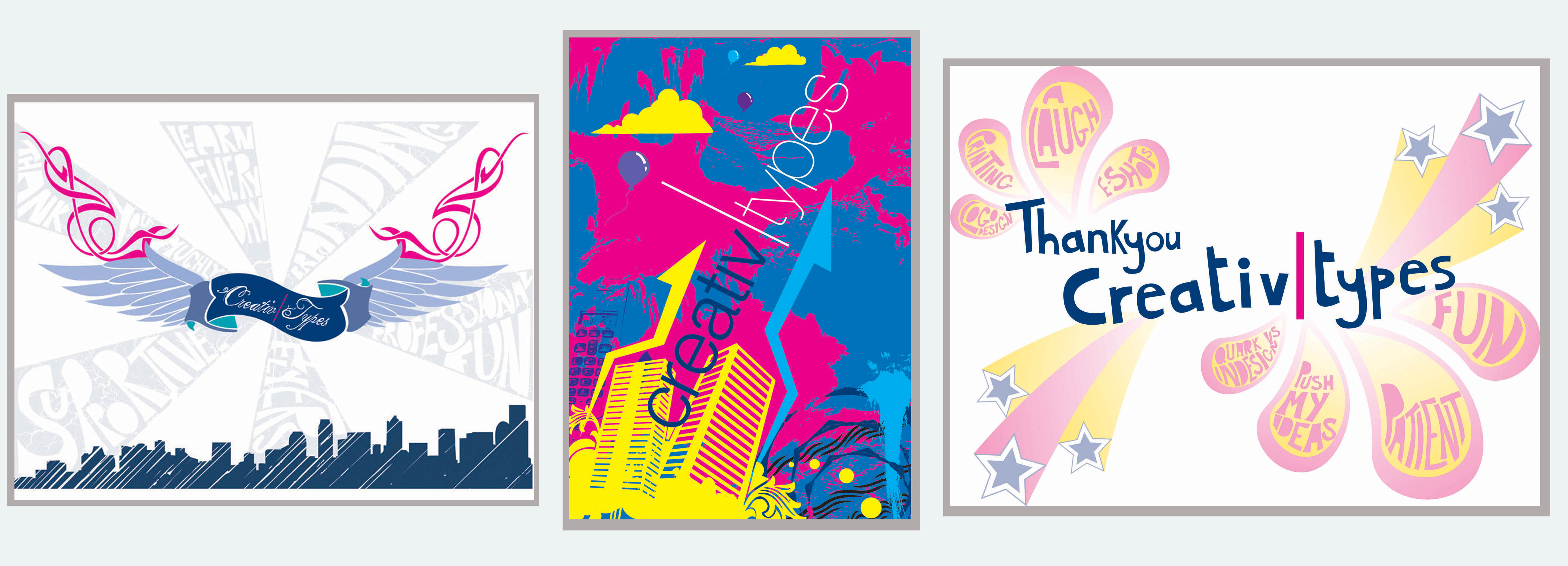
During the three week work placement I was asked by CreativTypes to make a few illustrations about my time there and what I had learnt, and the above images are the results. I tried to keep to the hand lettering theme, but wanted to experiment with styles to give a greater range of choice for CreativTypes. It was a fun and informative placement, and I learnt everything from Quark tips to printing preferences. Just being in the office and watching a graphic design company at work in the real world was such a thrilling experience because it meant that I saw behind the scenes as well as the client facing approach. They were also kind enough to include a trip to a printers so I could see all the different printing and cutting processes used to create different effects. I loved every minute, and had such a great time with the professionals at CreativTypes.

This project was mainly based in business, and the brief was to think up a new business idea and execute the business plan, finance and all related design features like logos etc. My new business was a jewellery design company who would make jewellery out of recycled bottle caps to sell on Leicester market. I aimed high.

Below are examples of the design of my company, and if you would like to see my business plan in real life, drop me a line.

My business logo. It was made from scratch from a photo of a seagull, and it was aimed at the ‘alternative’ market because that is the target market for my products:

New business logo small

Below is the business plan, created with the intention of breaking away from the ‘normal’ report style. It was landscape and unfolded to reveal contents on the far left, main business plan in the middle and appendix on the right. Both the report and the appendix were tabbed so people could easily find what they wanted when they read it. My tutor thought it was such an innovative way of doing it he showed it to the Head of the Design Council.

Business plan cover Business plan inners

The brief for the aerosol project was to change people’s attitudes about aerosols, informing and educating but not in a patronizing way. It was both group work and individual work, with the research undertaken by the group and the design solutions by the individual. Below is a sample of my work and the report we wrote as a group.

My individual design work:

Development of the final advert:
Original magazine cuttings Hand advert 1 Final advert in context

The group report and flyer design:
Green box 1 Green box insides The report inners

I took a gap year after A level, during which I attended Farnham Design College taking a foundation course in Graphic Design and Illustration. I also concentrated on synchronised swimming, as at the time I was part of the best team in Britain so it took a lot of focus! However, I did not flourish at the Farnham college and was not tempted into staying there for my degree because I did not fit into the environment. It had to happen sometime and thankfully it has not happened since! But below is a sample of the work that I produced during that time, featuring work from projects such as the Biro Project (centred around the humble biro pen) and a random illustration project.

Biro project drawings
Biro project: Drawing on hand made paper
Biro project: Fun with coffee stirrers
Biro project: Deformed circus animals (more fun than it sounds)
Biro project: Drawing on shoe insoles!
Final illustration Small texture block 1 Small texture block overall Small texture block 3